
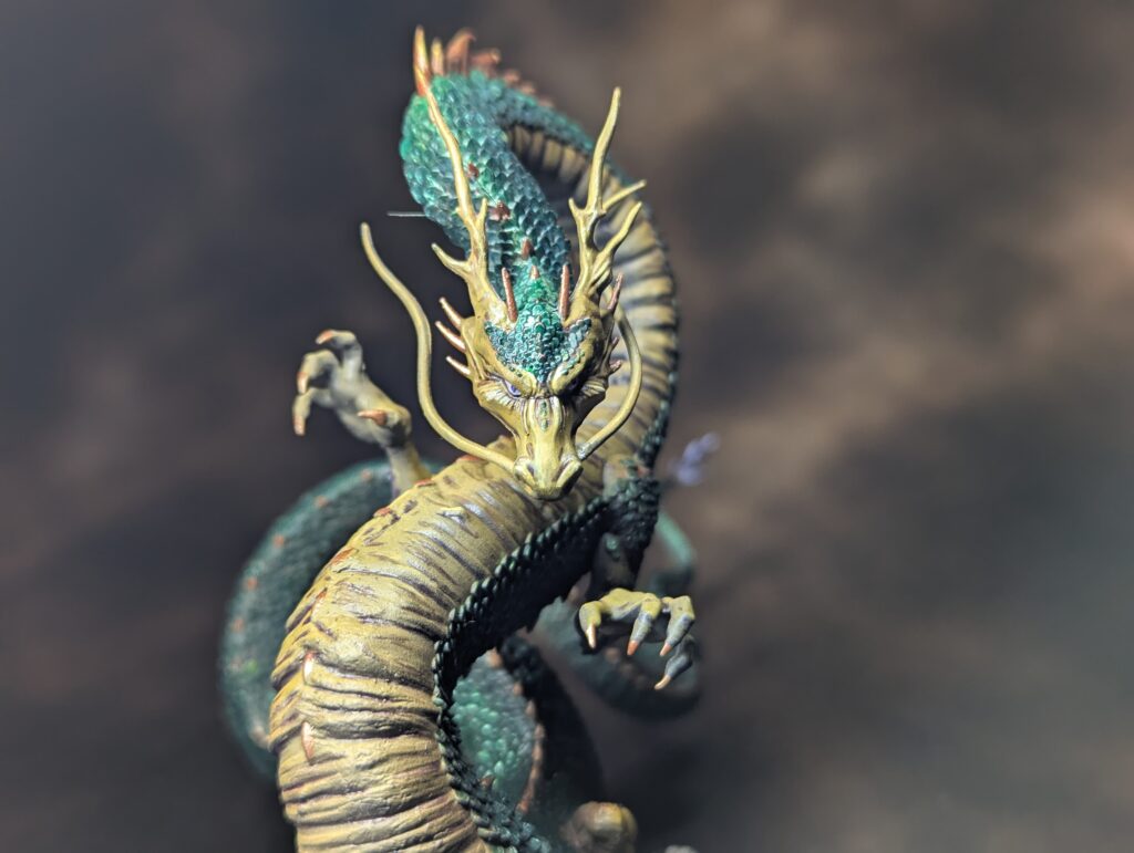
Painting the Shadow Emissary
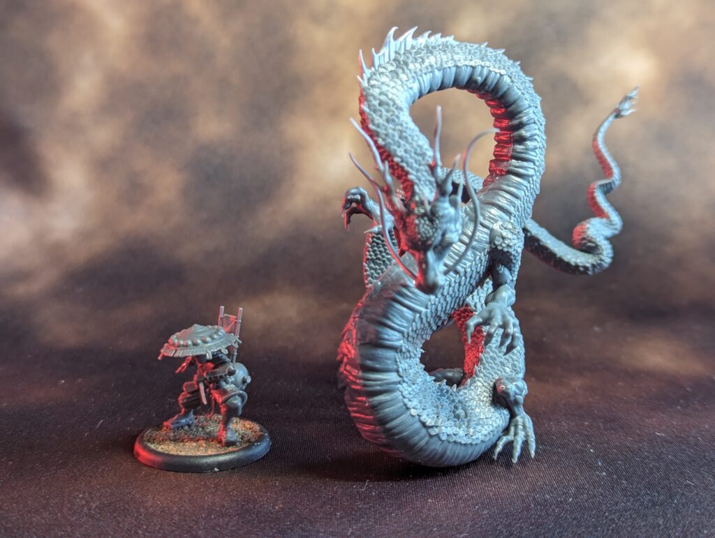
It’s been quite awhile since I’ve posted here. I’m still writing Infinity battle reports, they’re just under NDA because I’m playtesting Infinity N5 for Corvus Belli. This time I’m writing about a model I had a lot of fun painting, the Shadow Emissary from Malifaux, aka Shenron from DBZ. This is not really intended to be a full painting guide–talk about the height of hubris there. I’m just doing this as a record for myself, just as all the battle reports on this site are.
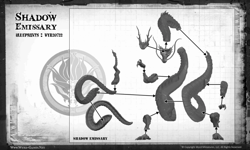
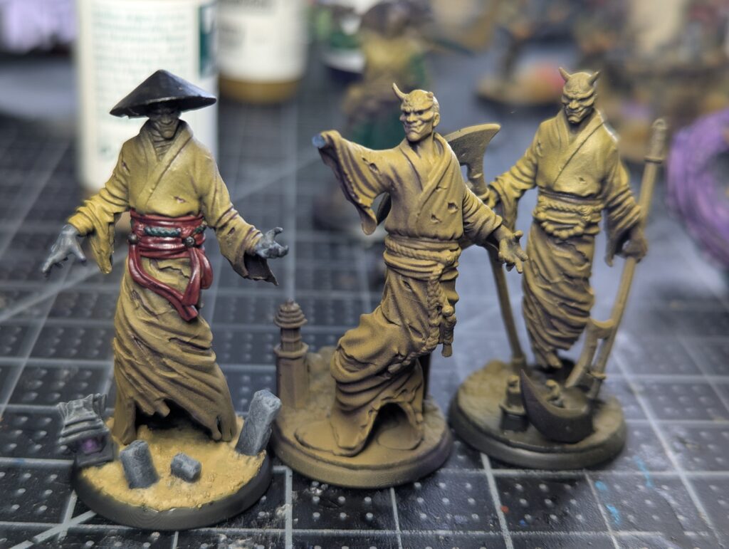
I’m not really into DBZ myself, but yellow belly green scales matches the rest of my Ten Thunders, so here we are. Assembly was somewhat painful, as is the case with pretty much all Wyrd models (although the most modern sculpts have improved substantially).
I think the most painful part was the very pronounced seams on the very organic parts of the dragon. I did a bunch of sprue goo mushing about to try and make it work, with mixed success, I think.
What I’ve learned from this exercise overall is that I’ve finally reached the point in my painting career where I care about gap filling and stuff now, because I’m putting in the time. Not that I did a good job here–what I’m saying is I noticed I did a bad job.
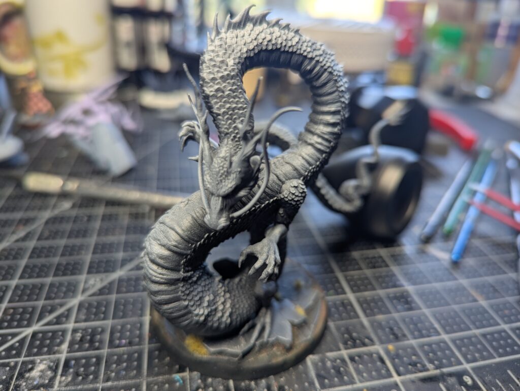
I started off by priming with Badger Stynylrez black with just a straight Liquitex Titanium White ink zenith to get a sense for value and how to approach the shadows for this… very wiggly model.
I then took a really long break from this model because I was pretty intimidated, but I had a boost of confidence from doing some yellow cloth work on some 3D prints (stls from Flesh of Gods). Had the great Jeff Rossiter print me up the STLs. First time working with this quality of print and I’m really happy with the detail… but that comes at the cost of resin brittleness. Nothing some CA glue can’t fix.
Anyway, I just re-used the same recipe.
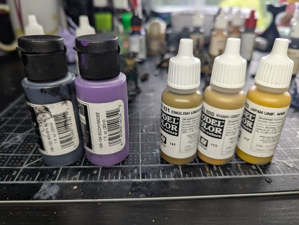
Blast the whole model with Badger Minitaire Ecchymose brought down with some Raven Black, then thin out some Vallejo Model color and triad it up from English Uniform to Khaki Grey to finally Japan Uniform WWII. After some pretty silly rotating the model around to get the spray angles I wanted, I’m left with this:
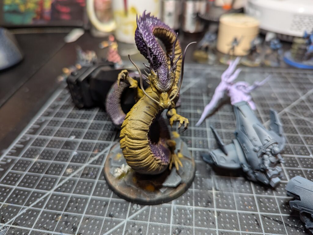
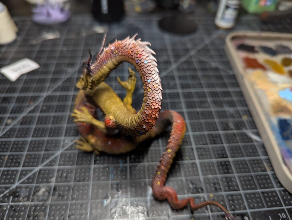
Lots of overspray to contend with, which I’ll have to clean up later. This whole thing was inspired by a tutorial I saw many years ago, where someone wanted a red dragon with a bunch of depth in the scales, so they went with a green base, picked out individual scales, and then hit everything with Badger Ghost Tint Red as a big filter. Only problem is Ghost Tint it notorious for burning through whatever you paint on top of it, and I’m too scared to try it and have it not work out but be stuck with it. I figured I’d try with some Monastic Green Vallejo Xpress Intense, which has a higher pigment count in contrast medium over the normal Xpress line.
Coverage is good, but it looks pretty flat and muddy. I complained to a group chat, and Obadiah (Nehemiah) came to my rescue and reminded me that I should push for red instead of purple undercoat as that’s across the color wheel from my desired green. So, back to the airbrush. Somehow I managed to avoid horrendous overspray problems with no masking. I started with Vallejo Hull Red in Model Air (my favorite red), then just worked my way up through Badger Minitaire Nebula Red, Angelic Blood, a touch of Hazard Orange before finishing off with the Liquitex White Titanium ink.
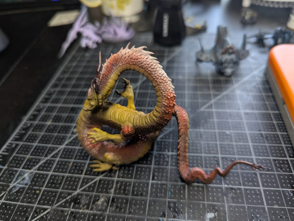
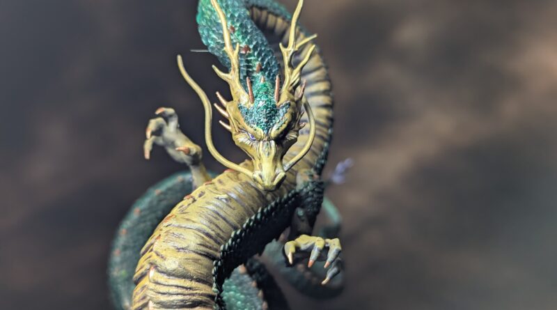
I’m pretty happy with the values now–paying special attention to what I think are the areas that would be brightest–I’m not 100% sure I got it all right but it looked good, which is what counts, right? Then I picked out random scales in metallic gold, silver, a purple, and various blues and reds.
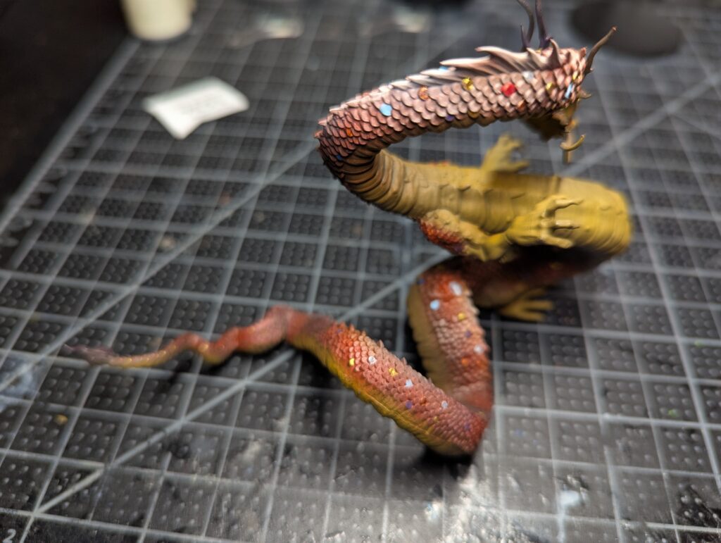
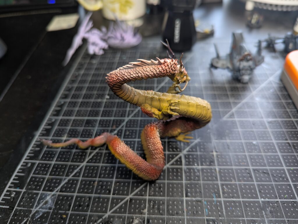
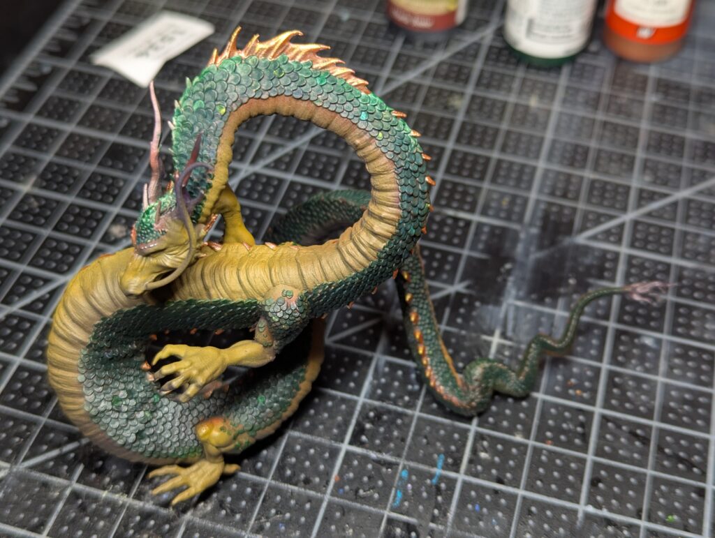
The dragon looks pretty silly now, but that’s all part of the plan! I then spent way too much time carefully doing 1-2ish coats of Monastic Green on top of all this, then picking out the… mane? and other dorsal scales in bronze, copper, and gold.
After that, it was time to do the base:
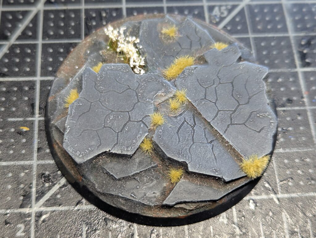
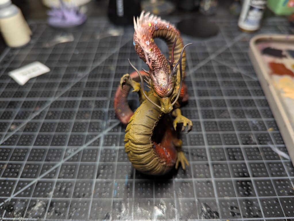
Nothing to see here… burnt sienna filtered with sap green wash, then various greys up to near white drybrushes on the rock, then lots of tufts. With the base done, I did a ton of careful “inking” with Vallejo Gloomy Violet Xpress, then highlighted everything up with the same yellows I used before, ending in Ice Yellow on the face.
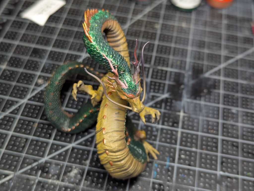
For the final touch, I used Greenstuff World’s green interference as a drybrush on the raised edge of the scales, which looks much better in person. It also kind of washed out the work I had done to pick out individual scales, which is a bummer, but I think they’re still subtly there in the final model and I guess I’m going to live with it.
A quick reptilian eye and a glue down to the base and we’re done!
I can push this a lot further, I think, but I’ve got more models than time, so I’m gonna move on for now. I think that this is a successful test of the technique and a good confidence builder in tackling a very intimidating model. What I’ve learned:
- Push the value contrast on the red->white even harder.
- The blues and golds seemed to do the most when picking out individual scales.
- Experiment more with the drybrushing of the inteference paint.
- I will say that using the Xpress Intense was important–I was not getting the results I wanted with Xpress Lizard Green. It was turning into a green wash on red, which was barf.
Thanks for reading.